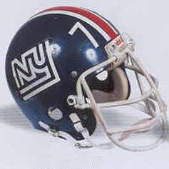
Dear Doctor, I was just wondering did the Detroit Lions actually ever wear the throwback helmets that they wore on Thanksgiving Day or did they always have some form of logo in the past? 
 
 
Dear Reader:
 
In 1934 the Portsmouth (Ohio) Spartans moved to Detroit and were renamed the "Lions." They wore the plain silver helmets, similar to the current helmet style worn for "throwback" occasions, starting with their first season in Detroit and continued wearing that style almost exclusively until 1961. In the early 1950s the Lions painted their helmets blue for night games to better distinguish the helmets from the NFL "Duke" football which was dyed white for night games during that era. After signing the leagues first national television contract with CBS in the early 1960s Pete Rozelle, former commissioner of the NFL, asked all the teams to enhance their uniforms with helmet logos and sleeve numbers. The Lions complied by introducing the famous blue colored "leaping lion" helmet logo and blue flanking stripes in 1961. A white middle stripe was added in 1968 followed by adding white trim to the "leaping lion" logos in 1970. With the exception of adding a blue face mask to replace the standard gray color in 1983, the 1970 helmet style has been unaltered until this year. In 2003 an additional black outline was added to the logo and to the outside edges of the flanking blue stripes.
 
We strongly feel that the Lions should wear their 1961 helmet style with the plain blue logos and stripes for "throwback" events. In addition to the tastefully understated style of the 1961 helmet it also reflects the era when, during their annual Thanksgiving Day battles, the Lions would regularly dominate the league champion Green Bay Packers. Please see the Helmet Hut feature story on the 1963 Lions Reunion to see pictures of this early 1960s era Lion's helmet.

click here for the Paper Lion Reunion


Dear Doc,

I remember as a kid growing up in St. Louis when Dan Dierdorf broke his jaw he had a special facemask. The thing looked like it weighed a ton. Do the teams do special add ons to existing masks, or do the manufacturers make special ones.

Thanks, Stevo
 
 
Dear Stevo:
 
Thanks for the interesting question.  If a custom face mask is needed to protect a specific facial injury it is typically designed and fabricated on a case by case basis by the face mask manufacturer (such as Schutt). The face mask manufacturer will normally consult with the team's trainer and or equipment manager prior to designing this type of face mask. The resulting customized mask style may be an exact or partial copy of an earlier mask that was designed for similar protective needs. However these customized face masks are not standardized for specific injury needs and they are not cataloged as ongoing product offerings. 
 
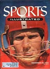
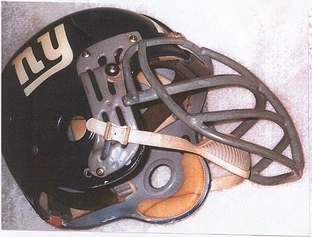
In the 1950s and 1960s era, prior to the luxury of overnight delivery, the team's trainer / equipment manager often had to rely on their own resourcefulness to design and fabricate a custom face mask that would protect a specific facial injury. Some of these attempts unfortunately resulted in more exposure for additional trauma to the injured player (see picture of "in house" customized mask / kitchen cabinet handle attached to Y. A. Tittle 1950s Forty-Niner helmet to safeguard his broken jaw). When time permitted a more effective solution could usually be provided by the face mask manufacturer (see the picture of 1960s era face mask designed and fabricated by Schutt to protect the Giant's Roosevelt Brown's broken jaw).


Hey great site.  I was surprised however to see that this question has not be answered yet on the site.  The Pittsburgh Steelers have the unique helmet design of a decal on only one side of the helmet.  I think I once heard a story saying that when originally ordering the decals they requested a number equaling that of the number of helmets neglecting to realize that they really wanted double that number for both sides of the helmet.  Can you confirm the story or elaborate?
 
Timothy O'Brien
Los Angeles, CA


Dear Timothy:
 
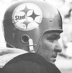
The Steeler logo, technically know as the "Steelmark," was originally designed in the 1930s by US Steel Corporation to promote the company and its steel products. In the early 1960s it was given to the American Iron and Steel Institute (AISI) and used in a major marketing campaign to educate consumers on the importance of steel in their every day lives.
 
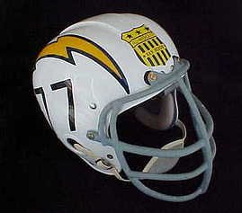
Much like the 1963 "All American City" award sticker worn (as a single sticker positioned front and center on their helmets) by the San Diego Chargers during the 1963 season to promote the city of San Diego, the Steelers wore a single "Steelmark" on the right side of their yellow helmets in the 1962 season to support the aforementioned AISI marketing campaign (see photo below). After the regular 1962 season ended the Steelers modified the "Steelmark" by changing the wording: "Steel" to "Steelers" and reducing the size of the decal. The modified "Steelmark" logo was adopted by the Steelers as its formal team logo in 1963 (or in the 1962 post season "Playoff Bowl" or conference "runners up" game in which the team participated in and wore black helmets for the very first time). The team decided to continue wearing the adopted team logo decal on only the right side of their helmets in the same style that they wore the "Steelmark" in the 1962 season. For more information on the origin of the "Steelmark" and the Steelers logo please go to Helmet Hut's "Helmet News" archives and find the February 2002 article called "Finally the Real Story."


Hey Doc, it's been awhile since I strained your brain but I am back with some more questions for you, after I say that the past year for Helmet Hut has been amazing. Lot's of big projects and publicity! I have been spreading the word about the site and the company every time I meet a new football fan and collector, and everybody goes wild when they see your repros and authentics. I hope 2004 is even better for you all! Now, on with the question...

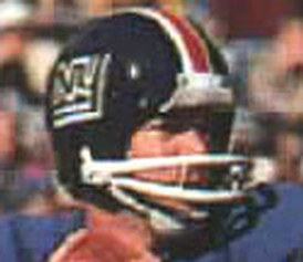
What was the story behind the strange "NY" logo the Giants used (I believe for one season in the 70's)? Why the change? Why was it short-lived (aside from the obvious: that it was ugly)? Do you have any pics of that one? I have had a very hard time getting a good, clear image of it.

Thanks so much, Michael Wall, Cleveland TN


Dear Michael:
 
In the mid 1970s former Giant great and Hall of Famer Andy Robustelli took a leave of absence from his lucrative travel agency business to accept the position of Director of Operations for the team. The Giants hoped he would be able to restore the floundering team back to the level of their championship days of the late 1950s and early 1960s when Andy led the team as a standout player. Andy felt that the current team, mired in a ten year plus slump, needed a complete image makeover including a uniform update. To complete one of his pet projects he hired a design firm to develop a new modernized helmet design. The resulting stylized "NY" / "outline" logo with white flanking white stripes added to the team's traditional red center stripe was introduced for the 1975 season. Unfortunately his efforts to revitalize the team were not successful and the new helmet logo was widely panned by both the team's fans and the New York press.
 
 A more traditional looking Giant helmet was adopted in 1976 with the team name "GIANTS" replacing the "NY" / "outline" logo (the flanking white stripes were also removed). Allegedly the "GIANTS" logo was used instead of returning to the original lower case "ny" design because the team had just permanently moved its home games to the Meadowlands in New Jersey and the team thought the old logo might be considered offensive because it had abandoned the city of New York.
 
 The team remained in the division cellar for four of the five years while under Andy's control after which he returned to his travel agency business. Andy provides a detailed account of his efforts to change the helmet design in his book --- "a Giant, Always...: My Two Lives With the New York Giants." The following picture reflects the "NY" / "outline" logo that he implemented in 1975: