|
|
|
Dear Dr. Del Rye,
Like everyone else who writes to the website, I am guessing that the others are like me and have purchased one of your helmets. I know that these are authentically made models of the Riddell helmets and believe me, the Rams helmet I bought from you is just like the helmet I did wear in high school so I know it’s the right thing. Here is my question because I noticed that compared to modern helmets and the Riddell models that came later, the suspension models are so much lighter and seem not as protective. If Riddell presented the helmets with the inflatable pads inside in the early seventies, and these were so much better for protection, how come so many players still wore the suspension type of helmets long after these newer types were available?
Robert J., Costa Mesa, California
Dear Robert,
Thank you for your questions. It is a bit similar to a question presented to me in 2001 but I will attempt to give a fuller explanation. There is no doubt that the suspension helmets, when compared to those introduced by Riddell in 1971 and 1972 that had the HA-91 and HA-92
Microfit designation, were much lighter and did in fact seem as if they offered almost no protection against head injury. Gerry Morgan of Riddell obtained the patent for a football helmet with an inflatable inner liner in 1971. The individual vinyl chambers were filled with glycol and interconnected so that the fluid moved through the chambers upon impact. The glycol used was similar to anti freeze to prevent freezing of the internal fluid while playing in the environs of Green Bay, Wisconsin, or Minnesota. Unfortunately, these helmets, in part because of the fluid and in part due to the structure of the lining necessary to contain the fluid, were quite a bit heavier than the RK or TK suspension helmets. These were also termed “water helmets” due to the fluid containing chambers although water was not used. Valves located on the crown of the helmet allowed the insertion of a hand held air pump that would be used to inflate the chambers that held air so that a proper fit was achieved for each individual player. As was described in a late-1970’s for-the-industry publication, the vinyl cushions “were crammed into every available space inside the helmet.” Needless to say, in addition to the added weight relative to the suspension helmets the installation of the chambers also reduced the helmet’s ability to ventilate the player and dissipate heat. Thus, many players, long accustomed to the lighter feel and better heat dissipation of the suspension models, were reluctant to give them up, even with the greater impact absorbing qualities of the new Microfit model.
Prior to the introduction of the Microfit helmets, Riddell had attempted to improve the energy absorption and dissipation qualities of the suspension helmet by inserting aero cells into the RK-2 and TK-2 models. Used between 1965 and 1969 the Rac-K2 was a RK-2 model that had eight aero cells inserted between the suspension webbing and crown of the shell. The Rac-H2 was the one piece TK-2 with the same internal design. From 1969 to 1978, the TK-2 model, the last of the Riddell suspension models, was modified to hold eighteen aero cells and was referred to as the Rac-H8. Attempting to combine what they believed to be the best features of the Microfit and Rac helmets, the Tak-29 was introduced in 1970 and remained in production until 1978, using the suspension system of the TK helmet and adding the inflatable neck feature from the Microfit. All of these “combination helmets” that included the Rac and Tak series, weren’t as heavy as the Microfit helmets but the added weight of the aero cells was enough to make many skill position players avoid their use as they did not like the added heft provided by the additional padding.
In 1974 Riddell improved the Microfit helmet and introduced the Padded Aero Cell or PAC-3 model. There was no need to pump up the vinyl cushions, and panels of cushions of varying sizes could be installed to achieve the correct fit for each player. This helmet had “thirty-two individual vinyl air cushions with layers of energy-absorbing foam.” Small holes within the crown allowed deformation and the ability to dissipate the impact force which was released through the openings in the surface. Although the preceding Microfit helmet remained in production into 1981, the PAC model was clearly Riddell’s best seller and was widely used. Thus the best answer to your question remains that the familiarity of the suspension helmets, its better ventilation, and lighter weight were all factors in keeping them in use after more protective models became available.
Dr. Del Rye
Dear Doc:
I've been a loyal fan of HH since 2001. I have nothing but respect and admiration for your site, your attention to the smallest detail and your accurate historical commentary. Please keep up the good work.
Like you, I tend to prefer the older uniforms of the 50's and 60's, and find myself cringing a bit when I see new uniform trends. For example, I strongly believe that West Virginia University lost their "must-win" final game of the 2007 season to lowly Pitt just because they looked like banana's in their "All Gold" digs. How could they muster up the dignity to actually win that game? In any event, we're seeing these mono-chromatic color combinations everywhere, even if pro football. When film-director, Oliver Stone first predicted it in "Any Given Sunday", it seemed far-fetched. Today it's everywhere. Is there anything that can be done? In baseball, those outrageous color combinations of the 70's have given way to a much more subtle and historically-minded trend of traditional uniforms. Is there anything we fans can do to bring that change to football, especially the NFL? How wonderful was it to watch the Giants capture the Super bowl in those beautiful early-'60's "away" uniforms? Maybe I'm just geezing.
MJR
Washington, DC
Dear Sir:
You are not “geezing” at all. Many of us at HELMET HUT are not fans of the current crop of uniform designs. Looking back upon the uniforms of the 1950’s especially those used by the colleges, there was a progression from jerseys that had identifying numbers on the front and back of the jersey to the introduction of the “television numbers”, identifying numerals placed on the sleeves or on the shoulders. The name of course, referred to the enhanced ability of commentators and fans inside the stadium and especially those watching television, to identify individual players. These numbers were usually 4” to 5” in height in contrast to the larger front and back jersey numerals. Standard for the 1950’s through ‘70’s were 10” numerals placed on the front of the jersey with either 10” or 12” numbers placed on the back. In the 1950’s these numerals were usually one color, contrasting with the jersey’s primary color and in one of the school’s official colors. By the late 1960’s and early 1970’s many universities had popularized front, back, and television numerals that were outlined or highlighted by a third color, making the numbers stand out on the background of the jersey even more.
Many pro teams and universities had no sleeve stripe design on their jersey, even into the early 1970’s though a few began to place a contrasting color elastic knit at the neckline or end of the three-quarter or short sleeve. Some schools used a simple two or three stripe design in the school color that matched the numeral color and contrasted with the white away jersey or primary school color of the home jersey.
There were a number of sleeve stripe designs that were more popular than others with the so-called “Northwestern” style striping perhaps the most frequently seen through the 1950’s. In a color that contrasted with the jersey’s primary color, the Northwestern stripe design consisted of a ˝” stripe, a ˝” gap showing the jersey color, a 3” stripe, another ˝” gap, and a ˝” contrasting stripe.
This three stripe arrangement later gave way to the “Packer” stripe arrangement when the dominant NFL team was winning its series of championships under the leadership of Head Coach Vince Lombardi. Of course, hotbeds of high school and college football such as Texas and California often demonstrated a number of unusual or infrequently seen combinations of shoulder and sleeve designs but these were not long lasting or widely viewed.
For those schools who traditionally wore a shoulder stripe insert, with LSU, UCLA, and Minnesota being the most obvious examples, the insert traveled under the armpit area and completely around the entire arm and shoulder area as a sewn in piece. This classy design has been replaced by a half or three-quarter stripe addition to those schools still using the shoulder stripe but the incomplete look merely looks like a cheap knockoff in the estimation of many uniform fans.
In the 1990’s, someone in the NFL marketing brain trust must have believed that it was necessary to abandon the traditional football jersey and pants designs in order to attract fans and/or increase the sale of NFL apparel. The jerseys especially took on a very stylized appearance with piping, contrasting side panels, and a multitude of sleeve or shoulder designs meant to be identifying logos for specific teams. The colleges were soon to follow this trend which appears to be ongoing with little hope of a return to the simpler, less cluttered, and more elegant older designs. One of the most ridiculous trends seen in the late 1990’s was the inclusion of black as a primary or augmenting color for teams that in the course of their entire history, had never before noted black as an official team or school color.
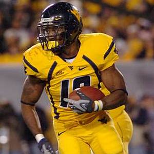
We agree with your observation, the uniforms seen today are “tacky”, classless, and crass attention-seeking displays designed to separate fans from their money, reflecting an escalating arms race mentality within the commercial marketplace. With West Virginia University a particular favorite at HELMET HUT, your specific example of the garish all-yellow Mountaineer uniforms as displayed on national television against Pitt in 2007’s backyard rivalry game, provides an example of what might be termed, “an over emphasis” on the school color…except they did not even present the appropriate school color! What you described so accurately as a “banana” appearance highlights the fact that many schools don’t even utilize their official school color but instead choose something that someone in marketing or licensing may believe is “better.”
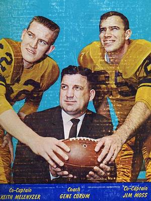
The more muted and stylish Old Gold of WVU was in fact worn as an “all yellow”, or as opponents and detractors sometimes referred to it, “all mustard” uniform design in the mid to late 1950’s. Syracuse and others at times adopted the “monochromatic” appearance with varying degrees of success. Head Coach Art “Pappy” Lewis believed it gave the Mountaineers a distinctive look, proudly presented the official school colors nicely, and as importantly, served to camouflage the football on WVU’s deadly belly series option plays. I believe there is room for monochromatic uniforms, utilizing the official school colors of an institution or professional team, but without the filigree that so often accompanies the attempts at “high fashion.”
Though the Giants did in fact wear one of the more “old fashioned” of the current NFL designs in winning the Super Bowl, it might not have satisfied those seeking a truly nostalgic look. However, compared to most of the current NFL uniforms, its relative simplicity was a breath of fresh air. Thank you for giving HELMET HUT the opportunity to stroll down memory lane with some jersey conversation.
Dr. Del Rye
![]()